EDITORIAL COVER
CONCEPT & VISUAL SYSTEM
The New Yorker
Design Brief
Develop a series of editorial covers inspired by The New Yorker, focusing on concept-driven storytelling and visual tone. Each cover explores a distinct narrative theme, Dark Humor and Nature in the City, while maintaining the publication’s refined, illustrative style.
The goal was to translate abstract ideas into clear, engaging visual concepts, using composition, character, and environment to communicate story at a glance. This project also explores the integration of AI as a tool within the creative process, supporting ideation and iteration while maintaining strong art direction and intentional design decisions.
concept 1:
the urban myth lives!
Character Direction
Enviornment
Editorial Reference
A playful reinterpretation of urban legends embedded within everyday city life. Cryptids and mythological figures appear in ordinary scenes, blending humor and subtle tension while challenging how we perceive the familiar.

Concept evolution
Initial Exploration
Final Direction

Placed within a real-world setting, the character shifts from concept to presence.


Refined Search Creation
#D8AA97
#B6D2D7

The character shifts from a static figure into something more narrative-driven, using environment and scale to build personality and context.


Contextualized Narrative


Contextualized Narrative
#7A4139
#DBAC8C


#95AEA1
#D8AA97

These concepts explore how editorial design can balance recognizable publication systems with distinct visual narratives. While both covers remain grounded in the established typography and structure associated with The New Yorker, each direction uses color, atmosphere, and environmental storytelling to create a unique emotional perspective.
Through concept development, typography studies, color systems, and real-world applications, the project demonstrates how editorial layouts can evolve beyond static publication design into immersive visual storytelling.
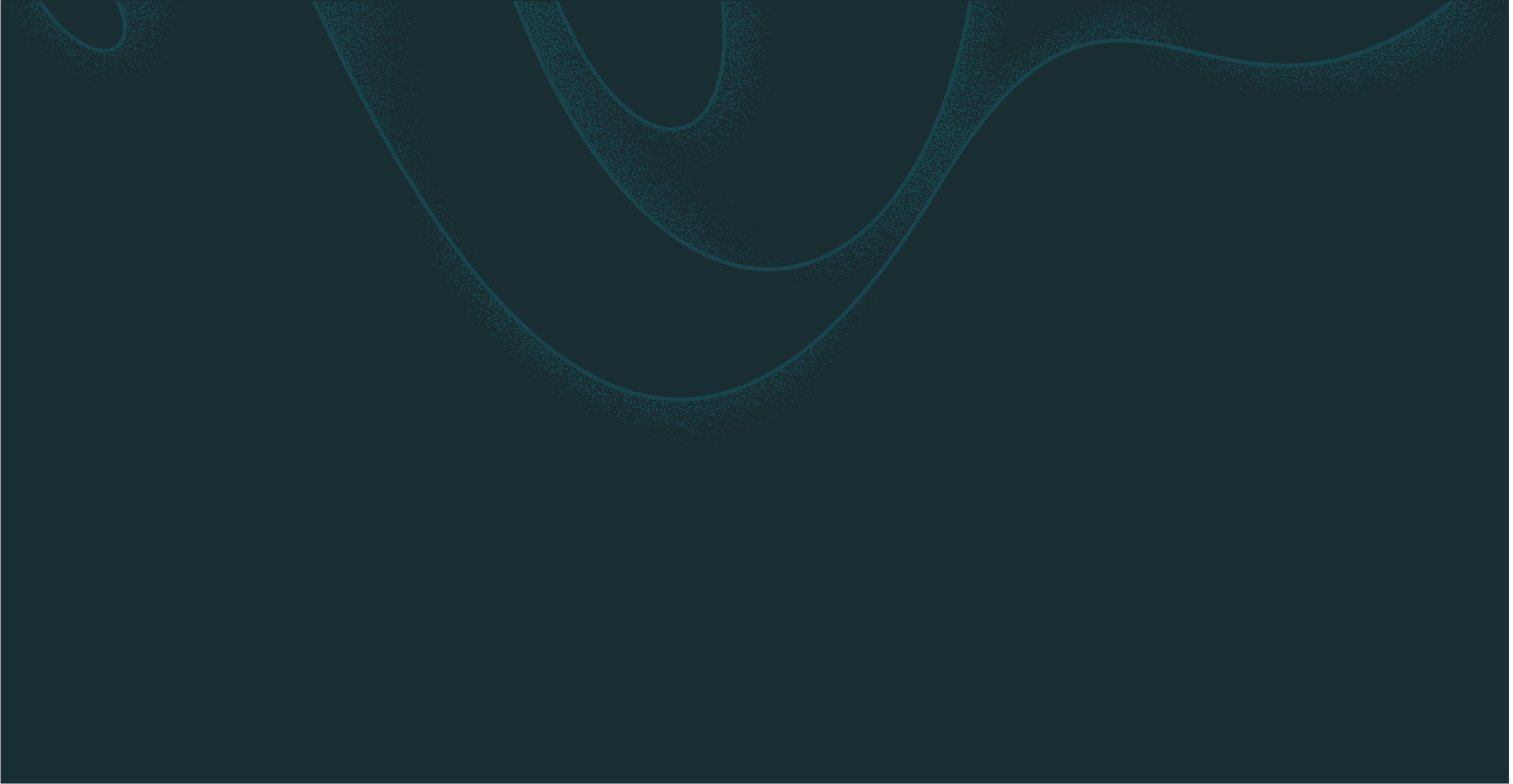
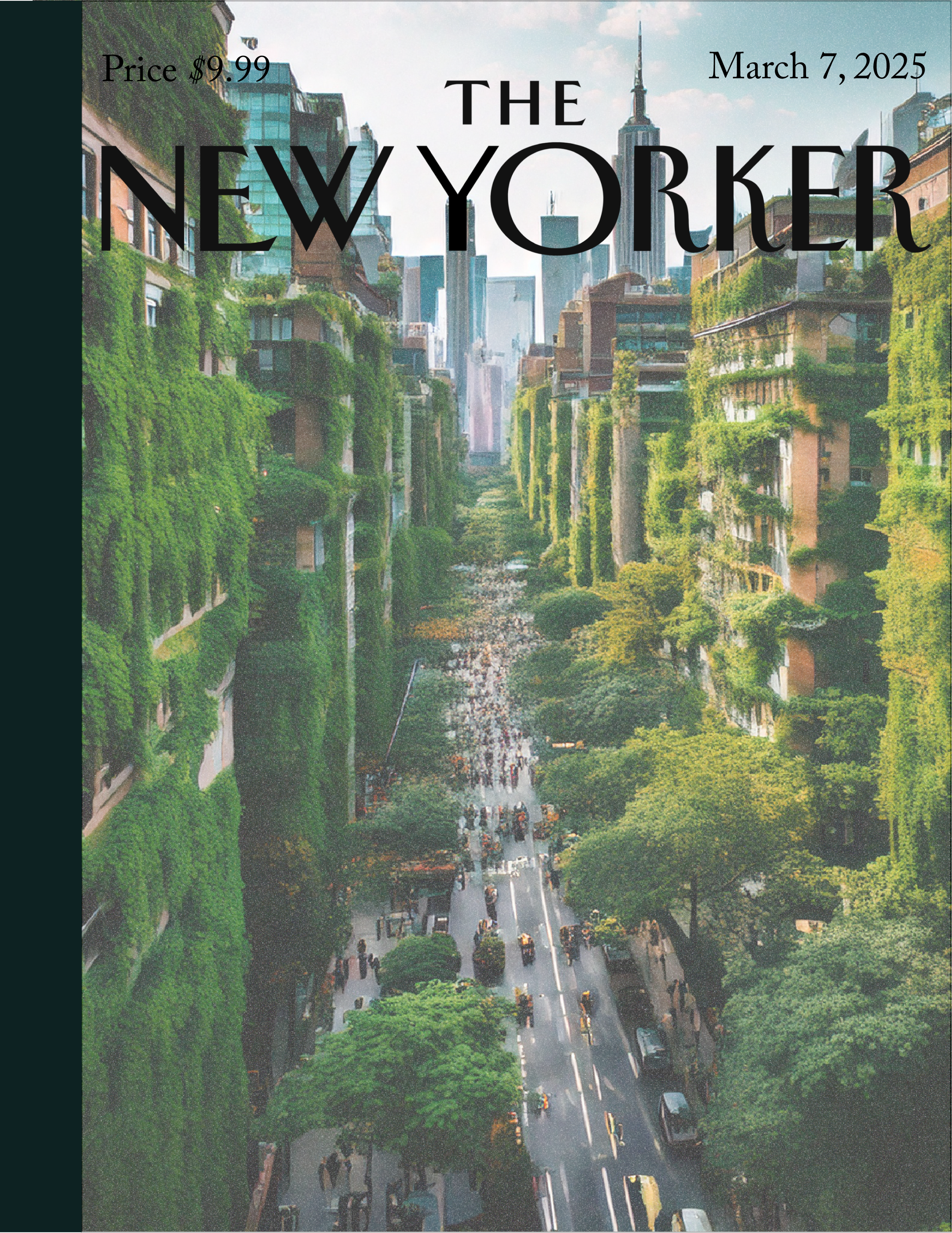
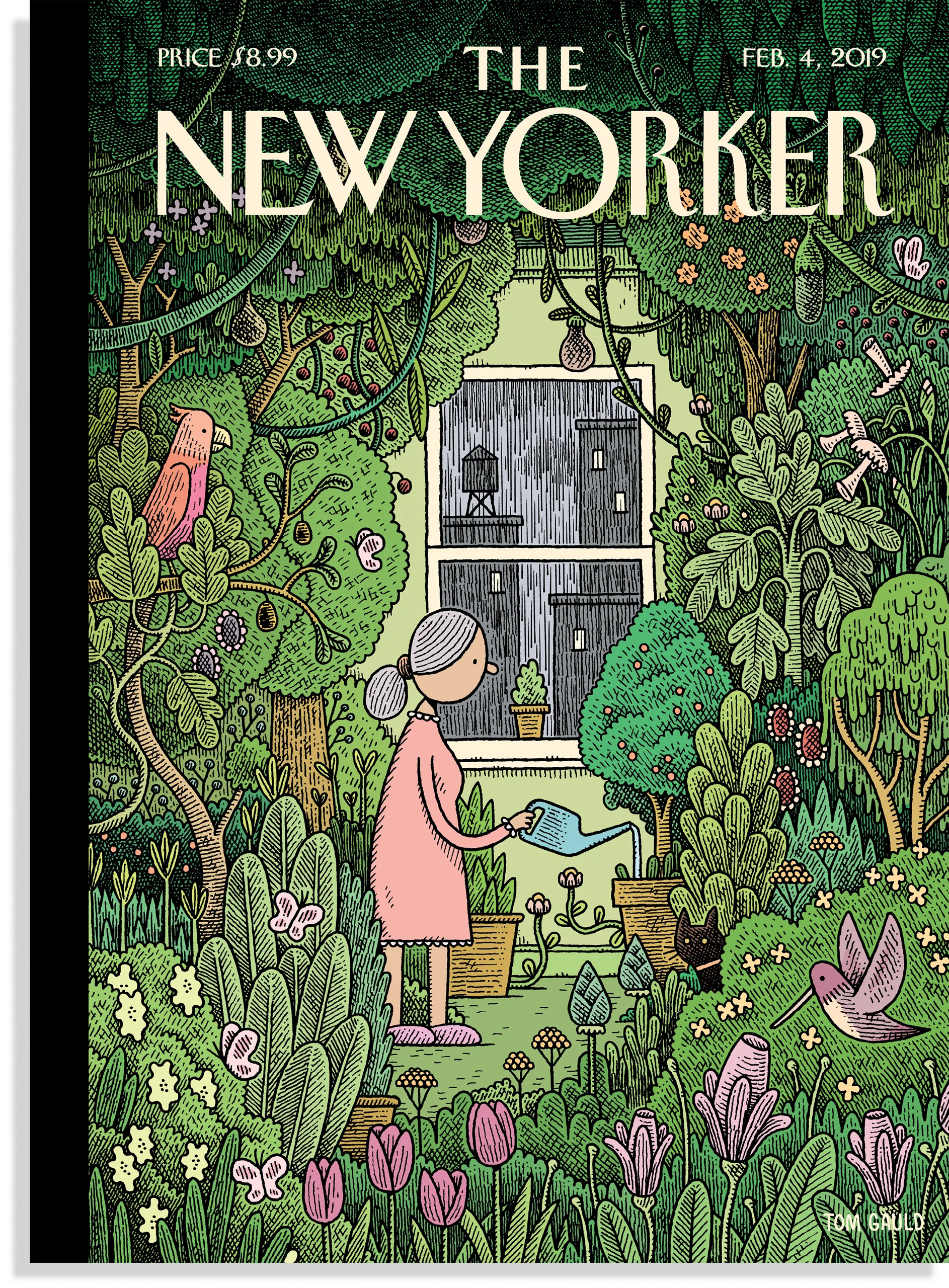
Concept 2: When nature reclaims the city
Encroaching
Quiet
Untamed
The concept evolves from subtle environmental shifts into a more visible reclamation, where nature begins to overtake the structures meant to contain it.
Initial Exploration

typography
Refined Direction
As nature reclaims space once defined by the city, the familiar begins to shift into something quieter, slower, and untamed.
Concept evolution
HEADLINE TYPOGRAPHY
The iconic typeface was hand-drawn by Irvin. It is used for cover subheads, occasional mastheads, and the header for the “Talk of the Town” section.
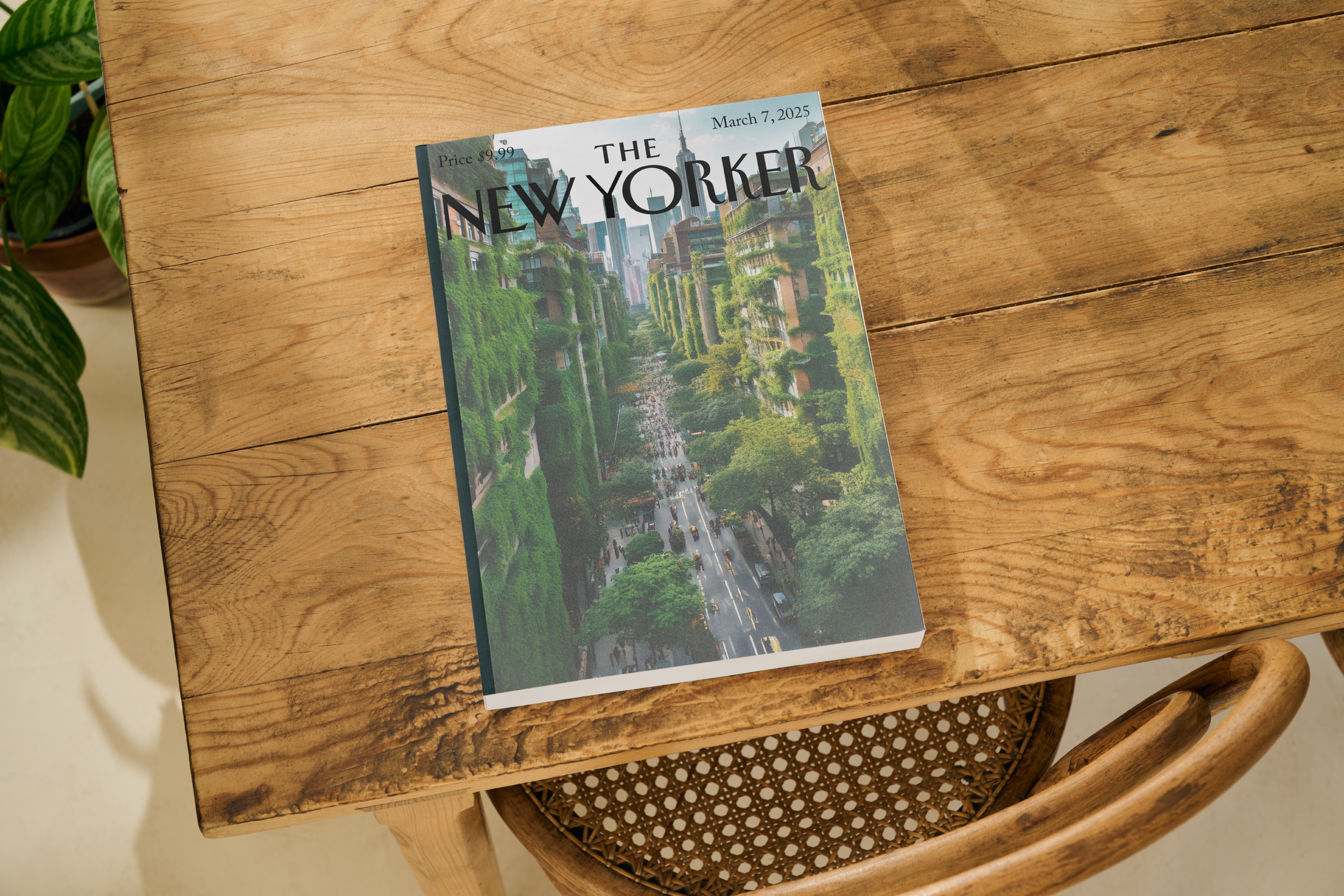
editorial mockups
Final Reflection
Final Direction
Placed within a real-world setting, the scene shifts from concept to presence.
NY Irvin / Rea Irvin, 1925
The typography system maintains the recognizable editorial hierarchy associated with traditional magazine publishing while allowing each concept to establish its own visual atmosphere through color and imagery.
colors
The Myth LIves
#544E7F
Muted transit tones and softened artificial lighting create a surreal urban atmosphere inspired by late-night city movement and editorial illustration.
When Nature Reclaims the City
#577D5B
Organic greens and atmospheric neutrals emphasize environmental overgrowth, softened architecture, and the quiet reclamation of urban space.
#8DB7C4
#8B9152